Staff Reports | Business & Commerce
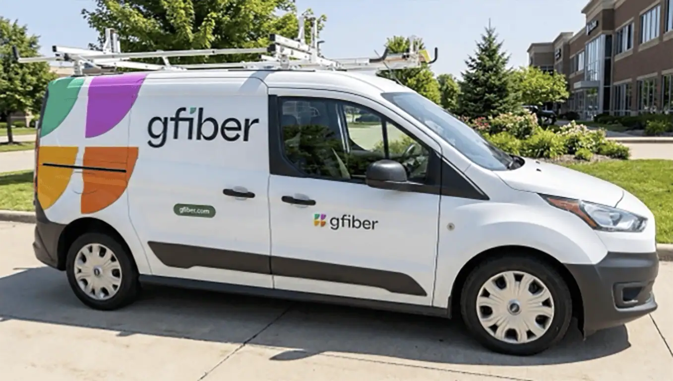
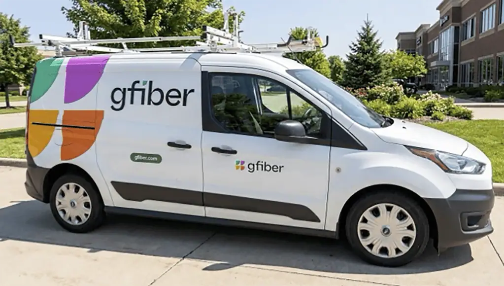
gFiber today unveiled a brand refresh featuring an updated logo, new typography and a color palette of teal, fuchsia, gold and orange. The visual updates will roll out across all markets beginning today.
“A brand is more than a collection of colors and logos — it’s the way we show up for our customers every day,” Dinni Jain, CEO of gFiber, said. “We’re excited to share our new look, but our core values stay the same: uncompromising standards for speed and reliability, phenomenal customer experience, and continuous innovation.”
The updated visual identity includes a new logo, typography and color palette that will be introduced across gFiber’s markets, digital platforms, community spaces and service operations, according to a press release.
The look may be new, but gFiber said its principles remain unchanged: maintaining standards for speed and reliability, focusing on customer experience, and continuing to innovate and improve.
The company has received recognition from several industry organizations in recent years, including customer satisfaction and internet service provider awards from J.D. Power, PCMag, CNET, Forbes, HighSpeedInternet.com and Reviews.org.
The new visual identity will roll out across gFiber’s digital platforms, local community spaces and service operations.